Kiyoshi Awazu: Poster
We are to find and research our design hero, and design an informational poster for someone who knows nothing about them. We will gather, curate and craft text, images and typography that best tell the story of the hero and their work.
I was really excited and intimidated to begin our design hero project—our first project as true C-track design students! Because we don’t learn a lot about Design History in our courses, I thought this could be a great opportunity for me to understand the transformation and application of design over the past century.
Finding my Hero
Because I didn’t really have a “design hero” to begin with, I searched the web for design work I simply thought looked cool and intriguing. I enjoy design styles with a lot of personality and playfulness, and so I began my list of possible design heroes: Massimo Vignelli, Alan Fletcher, Seymour Chwast, Kiyoshi Awazu, Otl Aicher, and Katsumi Komagata. I then narrowed my list down to three:


- Seymour Chwast: known for triggering the shift from sentimental realism to comic expressionism in the 1960s. I was attracted to his playful designs and characters, as well as his use of comedy and double entendres to comment on societal issues. Founded Push Pin Studios.
- Kiyoshi Awazu: I was amazed by his vibrant, psychedelic poster designs that create these surrealist and hypnotic worlds of characters, animals, and rainbows. Self-taught visual artist who laid some of the foundations for a new Japanese Graphic Design culture in the years following World War II.
- Massimo Vignelli: most famous for the iconic New York subway map and symbols! I loved his use of grid and color and bold typography.
And the winner is… KIYOSHI AWAZU!
I’m fascinated by Awazu’s work because of the way he deconstructs traditional Japanese graphics to create psychedelic and immersive visual experiences, forming these dream-like worlds of turtles, rainbows, heads, hands, and physiognomic forms with precise, meandering line work that evoke joy and playfulness, but also grief and tragedy. After further research, I also learned more about his design journey and goals; in particular, his philosophy of leveraging design as a tool for social commitment and responsibility resonated with me — “Awazu sees. Through seeing, he creates. And he shares the vision, however hideous, strange or beautiful it may be” (12 Japanese Masters, Saiki, 73). His background growing up against firebombed, post-war Japan influenced a lot of his work, and I think it’s really amazing to see how he transforms a history of destruction into artwork that is so harmonious and expressive.


Research
Because Awazu is an East Asian designer, I was a scared that there wouldn’t be enough information online. However, I found a couple of really thorough web articles, as well as a section in a book 12 Japanese Masters by Maggie (same name as me!!!!!) Kinser Saiki.
Key Points:
- Born in Tokyo, Japan 1929, death 2009.
- Self-taught artist who is worked across various genres such as painting, poster and book design, architecture, music, film, performance, and theatre.
- His style represented a statement against modernist dogmas that pursue the internationalization of soulless symbols. The designer’s mission was “to extend the rural into the city, foreground the folklore, reawaken the past, summon back the outdated.” — Awazu
- In 1954: Awazu joined the advertising industry as a part-time worker in a film company called Nikkatsu. At first, he was only involved in minor Kabuki theatre design projects, but a year later, his poster “Give Back our Sea” gave him the reputation of a respectable designer.
- 1969: collaboration in film Double Suicide ((心中天網島), directed by Masahiro Shinoda. Awazu worked as Art Direction and advertisement design. Subsequently won a Japan Academy Award
Moodboard + Kit of Parts
After conducting research and writing my 1500-word biographical essay on Awazu, I started to create my moodboards. I first pulled colors out of some of his most iconic posters to create my color palettes. His earlier pieces have a more neutral color palette of beiges and browns, but his later work is extremely vibrant and colorful, with rainbows being a frequent artistic motif.


Finding a typeface was rather difficult because most of the type in Awazu’s work is in Japanese. However, I found a few English phrases and numbers in some of his posters.


It seemed that most of his typefaces were a simple, bold sans-serif, or a more stylistic serif font with extreme contrast of thick and thin strokes. With these characteristics in mind, I narrowed my typeface search to Neue Haas Grotesk, Bodoni, and Nimbus Sans.

Thumbnail Sketches
For my poster, I wanted to integrate the warping fluidity and movement of Awazu’s topographic visuals into my typography. I sketched out ideas of the letters swimming and weaving through the line work, as well as other designs that play with the grid and scale. Because Awazu’s posters have so much movement, I didn’t want my type to be stiff and contained, and so I experimented with bleeding off margins and tilted type. I began to envision my poster incorporating a scrapbook feel—I wanted to maintain the hand-drawn/analog integrity of his lithograph work while adding my own playfulness by collaging various motifs and symbols together.


Going Digital
Because color is such a crucial element in Awazu’s work, I knew I had to try out compositions with image. I transferred some of my favorite thumbnail sketches to Photoshop and Illustrator. I first spent a bit of time cutting out assets in Photoshop to use in my poster: small graphic symbols such as hands, turtles, a goose, flowers, etc that are common through all of Awazu’s work.


After creating my library of graphics, I began to create the weaving effect of the letters. I used the eraser tool and slowly traced along each individual line and it took FOREVERRRRRRRR……. but I kinda like the result (first image)
For my second exploration, I wanted to try out the grid composition from my thumbnail sketches (second image), however the result was a little messier than I expected. I’m thinking that maybe I incorporated too many patterns?
For my last exploration (third image), I wanted to create a weaving cutout shaped like a river (now that I look at it, it also looks like black smoke or clouds) to reveal Awazu’s artwork in the background. I also played around with creating depth by interweaving Awazu’s name on-top and behind the black cutout.


Feedback from Brett
- Really liking how it is Awazu’s work combined with Maggie style, and the integration of text, color, image!
- Second layout: Top-right three images are not cropped enough like the other boxes, throws off the harmony of other boxes in grid.
- First Layout: Can the self-portrait be bigger and more cropped in through the side? Maybe it could be cool to integrate the Japanese characters of his name that you have in thumbnail sketches, in the same hand-drawn style.
- Third Layout: Text is too straight, maybe the timeline wiggles all the way up to the top of the page?
- Enjoys the contrast of digital and hand-drawn, but maybe can give text some texture or a slight blur.
- When erasing the wavy lines, NO FEATHER!
- Does each negative space need to be the black background? Maybe each segment is a different color.
Iterations
With Brett’s feedback in mind, I decided to move forward with Composition 1 and 3 (no more grid composition) and started to add the other required elements (timeline, descriptive text, quote, etc.) into my posters. This was actually a lot more difficult than I had anticipated; especially for the first layout, I loved how the page looked with just the graphics and name title, but when I started incorporating other elements, I couldn’t seem to get everything to fit just right.
I experimented with placing the body text in the center space of the page, right below the “Kiyoshi” title, but it looked too stiff in comparison to the organic movement of the graphics and typography. I then thought about how I could incorporate my quote to fill the space instead. I experimented with various methods to wiggle and weave the quote throughout the space to give the same organic and playful personality as the other poster elements, but neither compositions (see below) match up to my expectations just yet—the quote on the right still feels too stiff, and the quote on the left feels scattered and messy.
I tried handwriting the timeline elements in the left composition, but I also kinda liked the typed-out text of the right timeline—the numbers look as if they’re floating through the space.


The process of the second composition went a lot smoother (left image). I refined the edges of the black cutout, hand-drew the red squiggle timeline to extend it higher (in my final, I’ll have to make sure to draw it even longer off the page), and also added in my quote, captions, timeline dates, and body text. The body text still looked too stiff, and so I added a tilted drop cap to incorporate more playfulness and movement. There was also an area of dead black space between the timeline and body text. To activate the area, I remembered Brett’s feedback of integrating the hand-drawn Japanese characters, and redrew and added these character sketches in. This was the perfect finalizing touch to complete the composition (of course, I still have much refining to do).
Feedback from Brett
First Composition:
- Love how the type of the title is handled, but the quote can be more organic: if it went off the page or pulled under the image—needs more randomness that’s going on in rest of poster.
- Like the handwriting style of timeline
- Portrait: still needs to zoom in and face be bigger—could be cool if the turtle was on Awazu’s forehead
- Integrate the handwritten Japanese characters?
- Caption some of his work
- The green “handle” shape of the timeline squiggle can run off the left margin of poster.
Second Composition:
- Really close to done!!!
- Change the timeline dates to a darker tone rather than white, and make the title name white instead
- Change drop cap to grey color
- Quote: needs to push out more to the right and make it a brighter color
- Body text: leading too big, and spacing between paragraphs is too big
- Leading on all text boxes needs to be tightened, and rag is whack
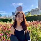
- Self-Portrait: too much useless space around Awazu, zoom in on his face more.
With Brett’s feedback in mind, I continued refining, exploring, and tweaking the details of my posters. For the “Quote Poster,” I kept playing around with the placement, sizing, and colors of the quote to weave and integrate the words better into the composition. After I was satisfied with the progress of both posters, I met with Hannah to get another perspective as I moved into the the refinement stage.
Feedback from Hannah
First Composition (Black Cutout):
- Put quote further down the poster and line length longer
- Caption and timeline is the same style which is confusing…
- Flip the timeline squiggle because its contradictory to the flow of dates (Unraveling means later down the squiggle, but the dates are going against this “flow”)
- Rag top line is too short
- Shift body text up
- Push “K” drop cap more in.
Second Composition (Quote):
- Less tight curves in the quote because letters are crashing into each other (can also increase tracking)
- It could be cute if the quote was coming from his mouth. Play around with italicizing, font weight…but the different colors are arbitrary
- Letter randomization of “Kiyoshi Awazu” can be less extreme
- How would it look if the Chinese characters in the background were completely digital and solid?
Hannah’s advice was super helpful, but a little overwhelming—I felt like I had so many small details to fix! Our last crit was tomorrow and so I spent the rest of the night refining and perfecting. One of Hannah’s advice was to turn the squiggle timeline upside down to better compliment the chronological flow of the dates (I thought this was such a genius observation). Because the original squiggle is cut from one of Awazu’s posters, I had to hand-draw and lengthen the squiggle to weave across the poster. I played around with many squiggle variations to get the most natural and fluid timeline.


Because the timeline would be starting from the upper-right hand corner now, I could integrate my timeline dates all throughout the poster, and so I added more dates and timeline descriptions. I also had to find a new spot for the quote; luckily, there was a section of empty dead space on the left-hand side that was perfect for the quote :D I spent some time working on my rag and leading, especially making adjustments to the rag of the small timeline captions. After a few more minor tweaks, my posters were ready for the second-to-last critique!


Feedback
- Its’s chaotic but very orderly and structured. Two great posters!
- Graphics and typography takes your eye on a pleasant journey down and around the poster
- Squiggle shape is at tangent with the title “Z” in “Awazu”
Final Refinements
I really liked the direction my posters were going in, but I still had a lot of work to get done before the final deadline. A lot of the graphics and illustrations I cut out weren’t the most precise (because I had done it in the beginning while still exploring), and so I went back and re-cut all my assets in Photoshop, including re-doing the title flow (the letters entangled in the line work). I also redid the black cutout, fixing some of the small imperfections and nuances of the curves. I also refined my rag, re-cut the portrait with more precision, and added more handwritten timeline dates.
Here are my final posters!


Here are the posters printed and pinned up:

Reflection
I had a lot of fun with this poster project! I learned a lot about Kiyoshi Awazu and his design philosophy, and completely fell in love with his psychedelic and quirky artistic vision and style. I was definitely intimidated in the beginning of the semester because I feel like poster design isn’t my strength, but it was fun taking pieces and parts from his posters to create my poster, and I’m really satisfied with the result. I’m excited to see how elements of this poster will translate into the next design hero projects…